 免費AI編程助手
簡介
這個效果是在看 CSS Secrets 這書上看到的,感覺很不錯; 實現(xiàn)原理也挺簡單的;
效果圖及實現(xiàn)
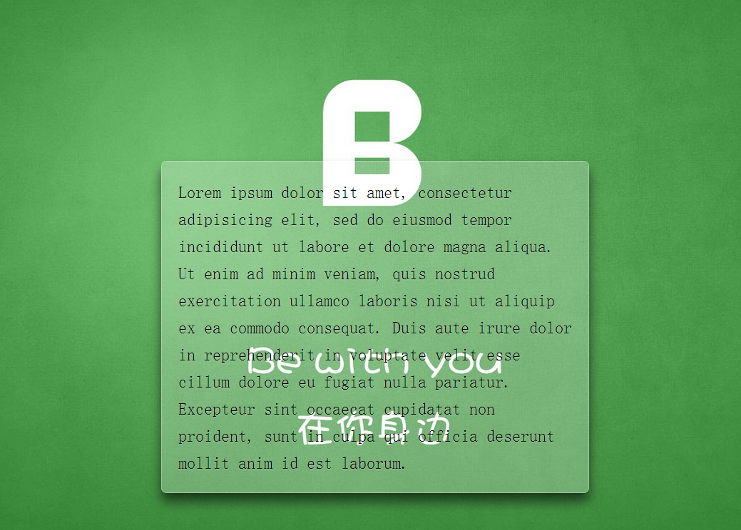
效果圖
代碼實現(xiàn)
<!DOCTYPE html>
<html lang="en">
    <head>
        <meta charset="UTF-8">
        <title>Document</title>
        <style>
                    /**
                     * 設置背景圖全屏覆蓋及固定
                     * 設置內部元素偏移
                     */
                    body {
                        /*此處背景圖自行替換*/
                        background: url(demo.jpg) no-repeat center center fixed;
                        background-size: cover;
                         min-height: 100vh;
                        box-sizing: border-box;
                        margin: 0;
                        padding-top: calc(50vh - 6em);
                        font: 150%/1.6 Baskerville, Palatino, serif;
                    }
?
                    /**
                     * 整體居中功能;
                     * 背景透明虛化
                     * 溢出隱藏
                     * 邊緣圓角化
                     * 文字增加淡陰影
                     */
                    .description{
                        position: relative;
                        margin: 0 auto;
                        padding: 1em;
                        max-width: 23em;
                        background: hsla(0,0%,100%,.25) border-box;
                        overflow: hidden;
                        border-radius: .3em;
                        box-shadow: 0 0 0 1px hsla(0,0%,100%,.3) inset,
                                    0 .5em 1em rgba(0, 0, 0, 0.6);
                        text-shadow: 0 1px 1px hsla(0,0%,100%,.3);
                    }
?
                    /*使用濾鏡模糊邊緣*/
                    .description::before{
                        content: '';
                        position: absolute;
                        top: 0; right: 0; bottom: 0; left: 0;
                        margin: -30px;
                        z-index: -1;
                        -webkit-filter: blur(20px);
                        filter: blur(20px);
                    }
        </style>
    </head>
    <body>
        <p class="description">
        Lorem ipsum dolor sit amet, consectetur adipisicing elit, sed do eiusmod
        tempor incididunt ut labore et dolore magna aliqua. Ut enim ad minim veniam,
        quis nostrud exercitation ullamco laboris nisi ut aliquip ex ea commodo
        consequat. Duis aute irure dolor in reprehenderit in voluptate velit esse
        cillum dolore eu fugiat nulla pariatur. Excepteur sint occaecat cupidatat non
        proident, sunt in culpa qui officia deserunt mollit anim id est laborum.
        </p>
    </body>
</html>
總結
這種實現(xiàn)模式是考慮了性能來寫的,以及維護上的考慮
- 比如使用了 em,可以很輕松的放大縮小整體大小
- 這里使用了 hsla,這是我第一次使用這個顏色值;以前只在 ps 調整這個,很不錯的顏色模式.和 RGBA 大同小異,但是 HSLA 更符合人類眼睛的觀看;
- 還學到了一種新的背景縮寫方式
/*分開寫*/
background-color:#ff0;
background-image:url(background.gif);
background-repeat:no-repeat;
background-attachment:fixed;
background-position:0 0;
background-size:cover;
?
/*簡寫*/
background: #ff0 url(background.gif) no-repeat / fixed cover;
/*設置background-size必須用單斜杠隔開*/